
PANTONE x YAYOI KUSAMA
This project was originally part of the Product Development Class in the art direction’s track of the MS in Global Strategic Communications program at Florida International University and Miami Ad School.
The Flight Plan
Scope of Work:
Concept Development & Experiential Design – Spatial Renderings (AI-assisted)
Branding & Product Development – Product line & Packaging Concept (AI-assisted)
Digital Campaign – AR Activation (AI-assisted), Social Media Promotional Assets (Mobile & Web), DOOH
The Brief & Objective
Briefing: For this project we were asked to create the concept of an experiential campaign with a collaboration between a brand and an artist and develop a product line.
Originally developed as a conceptual campaign, this project was revisited to explore how the idea could evolve through today’s increasingly AI-enabled creative landscape and a more developed approach to visual and spatial design. The second iteration refines the experiential environments and reimagines the product line, using AI as a creative tool to explore possibilities that expand the original concept.
PROBLEM: Brands are trapped on screens, fighting for fleeting glances in a sea of visual noise.
INSIGHT: Digital fatigue has made audiences numb to passive viewing.
CREATIVE OPPORTUNITY: Take Pantone off the screen and turn it into an unforgettable, multi-sensory physical experience.
The Executive Decision: A high impact collaboration where Yayoi Kusama’s signature polka-dot universe merges with Pantone’s iconic color standards, turning a public park into a multi-sensory journey that forces people to step off their screens and feel color firsthand.
THE BIG IDEA
Pantone park – a multi sensory experience.
COLOR, EXPERIENCED
The concept was rooted in the insight that in an increasingly saturated digital landscape, a social media ad alone is not enough to create a lasting brand impression. Brands can build stronger connections by creating experiences that people can physically see, hear, touch, smell, and engage with.
By pairing Pantone with Yayoi Kusama—whose immersive environments transform color, repetition, and visual language into physical experiences—the project sought to take color beyond the visual and into the senses.
Pantone Park reimagines color as something to be experienced, not simply seen.
EXECUTION: Pantone Park in Central Park (experiential) + Pantone x Kusama product line.
TECHNOLOGY LAYER: AR brings Pantone Park to the world. This makes the campaign not just physical,but viral and global.
DELIVERABLES
- spatial renderings
- AR Activation
- Social Media Videos
- DOOH
- Product Line
Design Strategy

BIG APPLE RED
Pantone 19-1664 became the visual anchor of the system.
Its bold, raw quality was chosen as a visual interpretation of New York City: dense, energetic, and unapologetically bold. The color was renamed Big Apple Red, connecting Pantone’s color system to the project’s New York setting while giving the campaign its own signature color.
Its bold, raw quality was chosen as a visual interpretation of New York City: dense, energetic, and unapologetically bold. The color was renamed Big Apple Red, connecting Pantone’s color system to the project’s New York setting while giving the campaign its own signature color.
Big Apple Red became a recurring element across the identity, icon, packaging, product line, DOOH, and social media campaign.
However, the system was never intended to be limited to red. Other Pantone colors were introduced throughout the sensory product line to reinforce the breadth and versatility of the Pantone color system.
Red established the identity; the broader palette demonstrated
the possibilities.
FIVE SENSES
The product strategy was intentionally designed as a journey through the five senses, transforming Pantone’s traditionally visual language into physical experiences.
Sight — Infinity Mirror Cube
Hearing — iDot Bluetooth Speaker
Touch — Tactile Blanket
Smell — Scented Candles
Taste — Ceramic Fruits
The sensory products used a variety of Pantone colors, while maintaining a noticeable presence of Big Apple Red throughout the collection.
Additional products—including T-shirts, hats, totes, notebooks, and the 19-1664 swatch card—extended the concept into a more traditional Pantone merchandise system, allowing the color itself to become the focus.
This created two complementary product directions: Kusama’s artistic language shaped the sensory experience, while Pantone’s branding language shaped the color-focused merchandise.
TWO VISUAL LANGUAGES
The visual identity needed to bring together two distinct worlds: Pantone’s precision and color-centric design language and Kusama’s immersive, expressive visual language.
A less expected Kusama pattern was selected as the primary graphic element. Rather than relying on her more recognizable linear dot compositions, the chosen pattern offered a more distinctive and adaptable system that could translate across products, packaging, and spatial applications without becoming overly literal or cliché.
The sensory products leaned into Kusama’s visual language, using her pattern vocabulary and a broader color palette to create an immersive and playful experience.
Conversely, the supporting merchandise leaned more heavily into Pantone’s branding language, making the color itself the hero through the campaign logo, icon, and Big Apple Red swatch.
Packaging and shopping bags provided a minimalist counterpoint to the expressive product line, using black typography on white, asymmetrical compositions, with imagery of the experience integrated into the design.
Together, these two visual languages created a cohesive Pantone × Kusama universe—one where Pantone provides the system and Kusama provides the immersive expression.
Logo
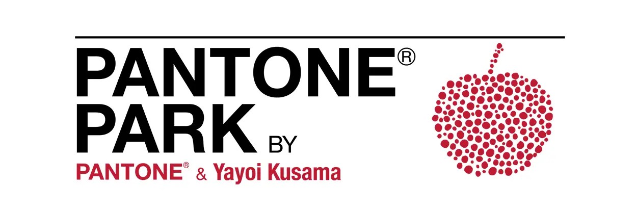
The PANTONE PARK identity brings together the visual language of Pantone and Yayoi Kusama into a unified campaign mark. The horizontal lockup draws from Pantone’s established typographic aesthetic, using bold Helvetica, uppercase lettering, and a horizontal rule to create an immediate visual connection to the brand.
Beneath the name, “by Pantone & Yayoi Kusama” functions as a smaller attribution line, reinforcing the conceptual partnership without competing with the primary mark.
To the right, a dotted apple icon translates Kusama’s signature pattern into the campaign’s defining symbol. Built entirely from the dot pattern, the apple connects the identity to Big Apple Red while creating a flexible graphic element that can extend across products, packaging, digital experiences, and environmental applications.
The Flight Path
Digital Deliverables
Product Line


The Flight Log
CLIENT
– Miami Ad School — Academic Project
ROLE –
Creative Strategy & Art Direction
TOOLS –
Adobe Illustrator · Adobe Photoshop · Adobe Premiere Pro · Midjourney
PEOJECT TIMELINE –
Original: 2023 · Revisited: 2026

 Dani Galindo - Art Director & Creative Strategist