YAYOI x PANTONE
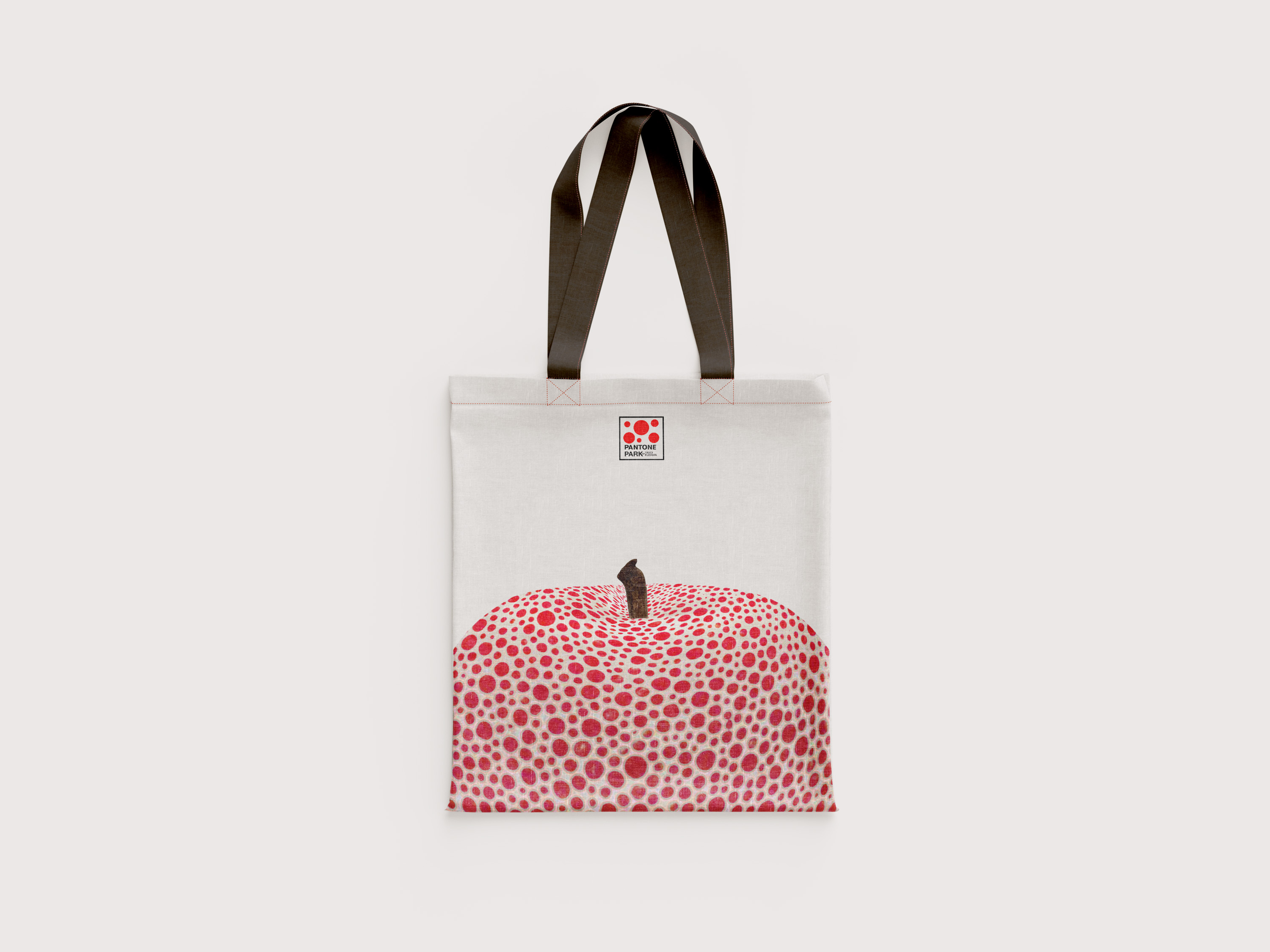
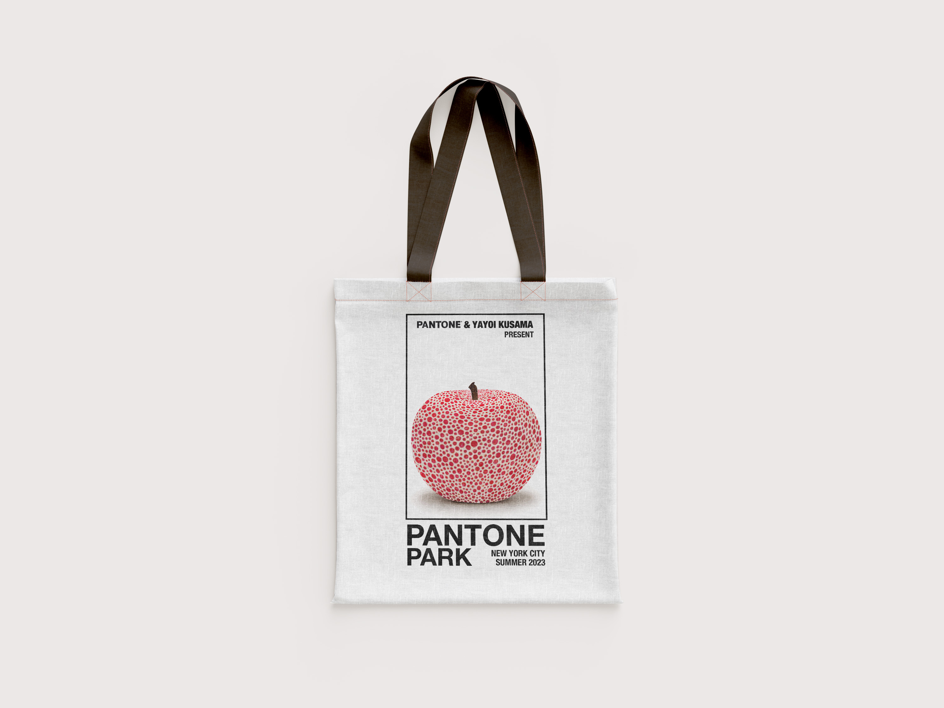
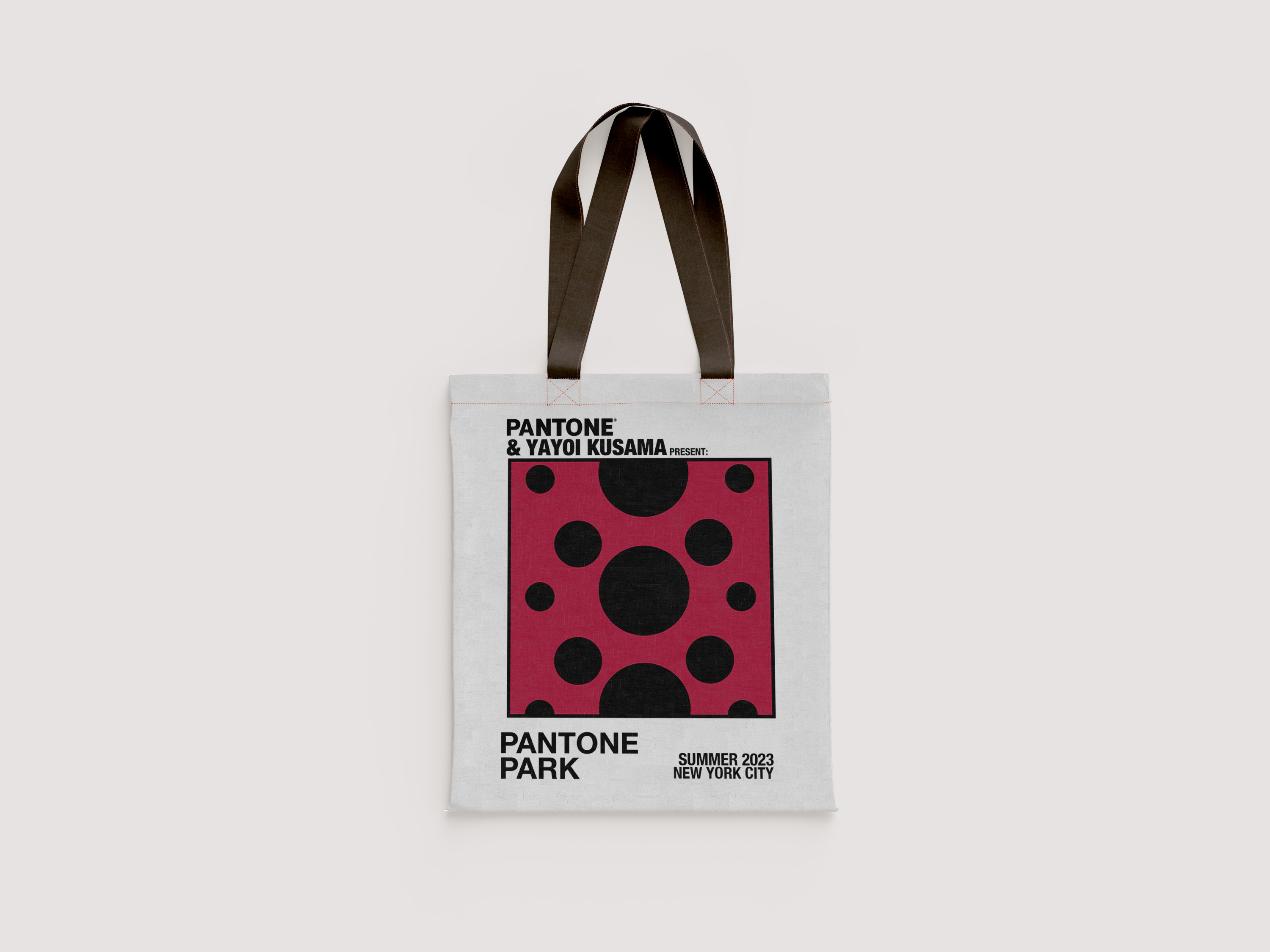
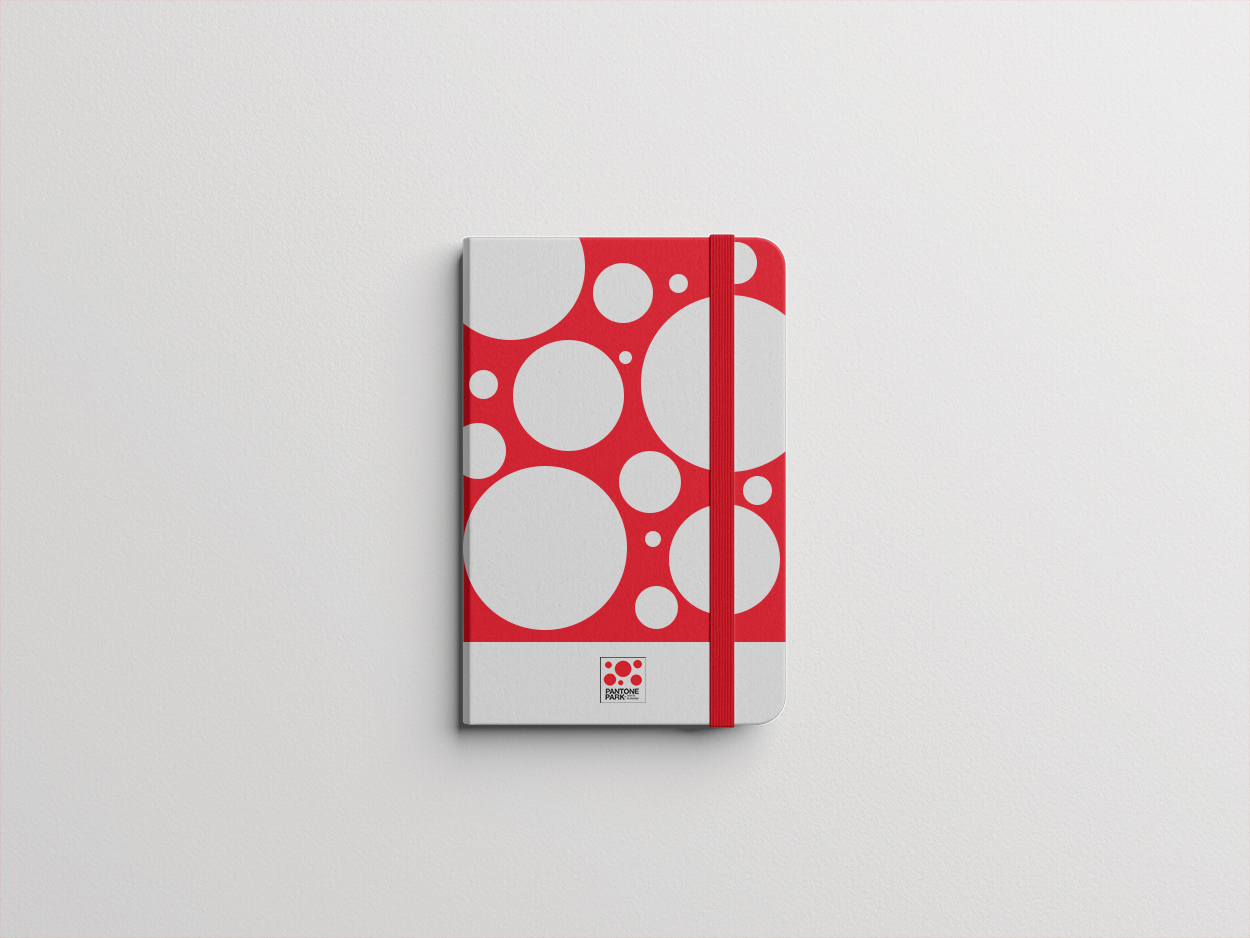
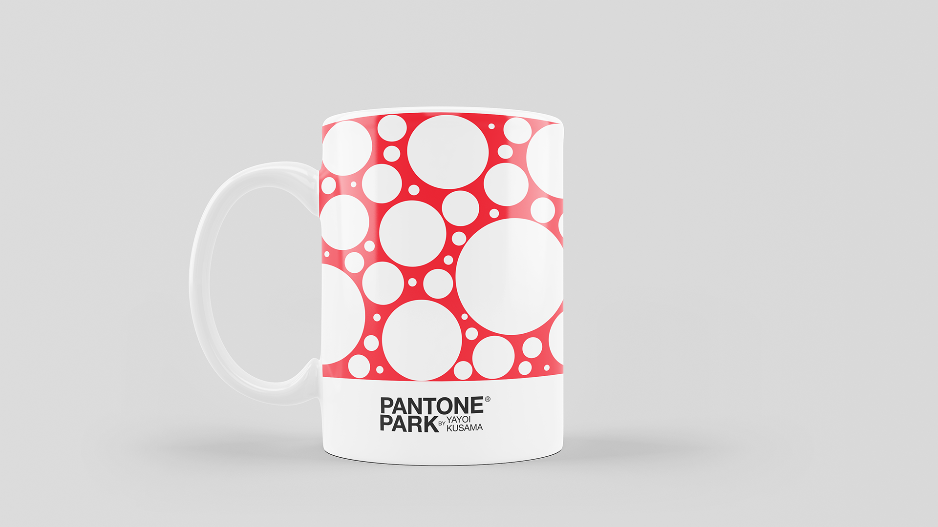
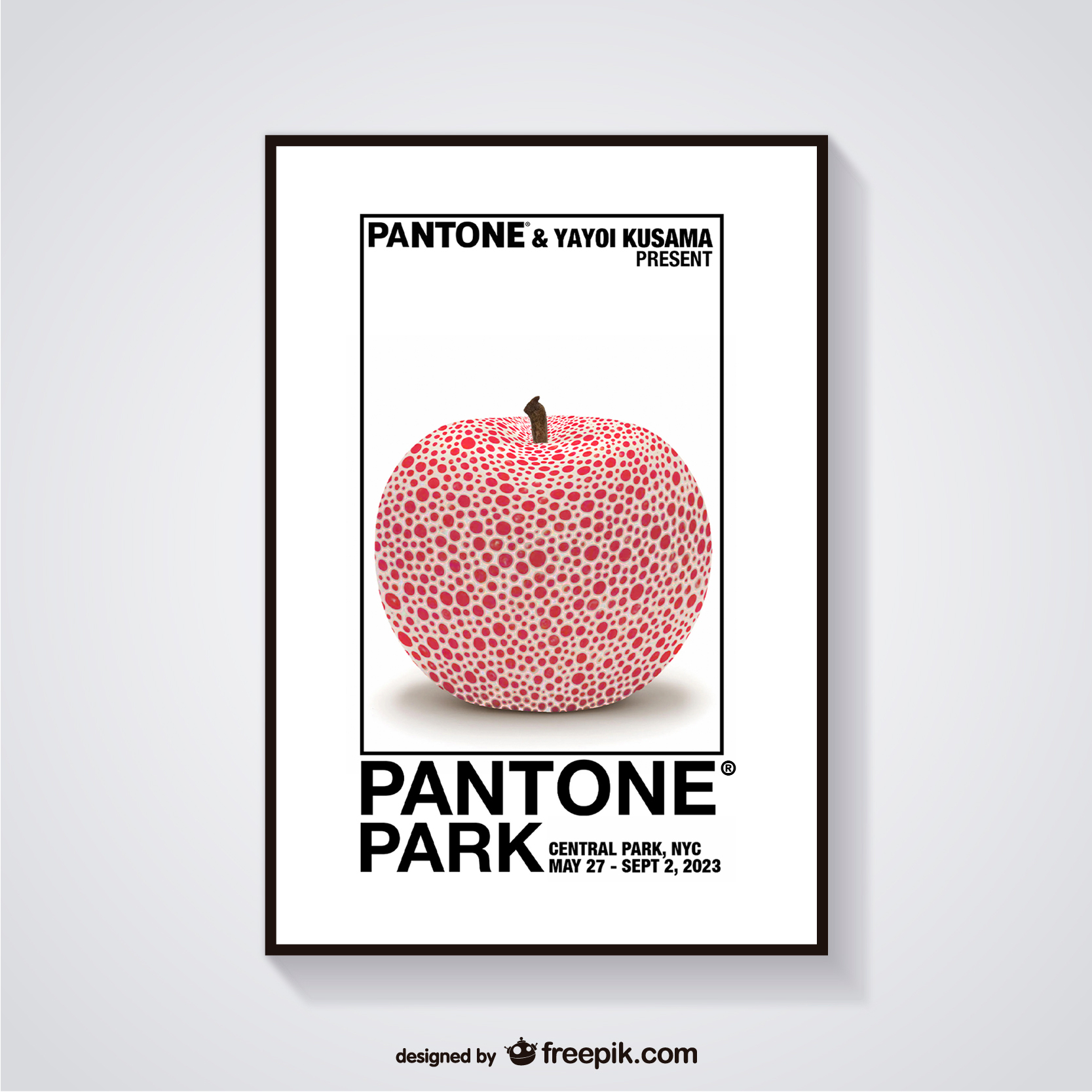
This project was part of the Product Development Class in the art direction’s track of the MS in Global Strategic Communications program at Florida International University and Miami Ad School. For this project we were asked to create the concept of an experiential campaign with a collaboration between a brand and an artist/celebrity. My contribution, presented below, consisted in creating the visual identity and branding for the event as well as the creation of a product line.
The Flight Plan
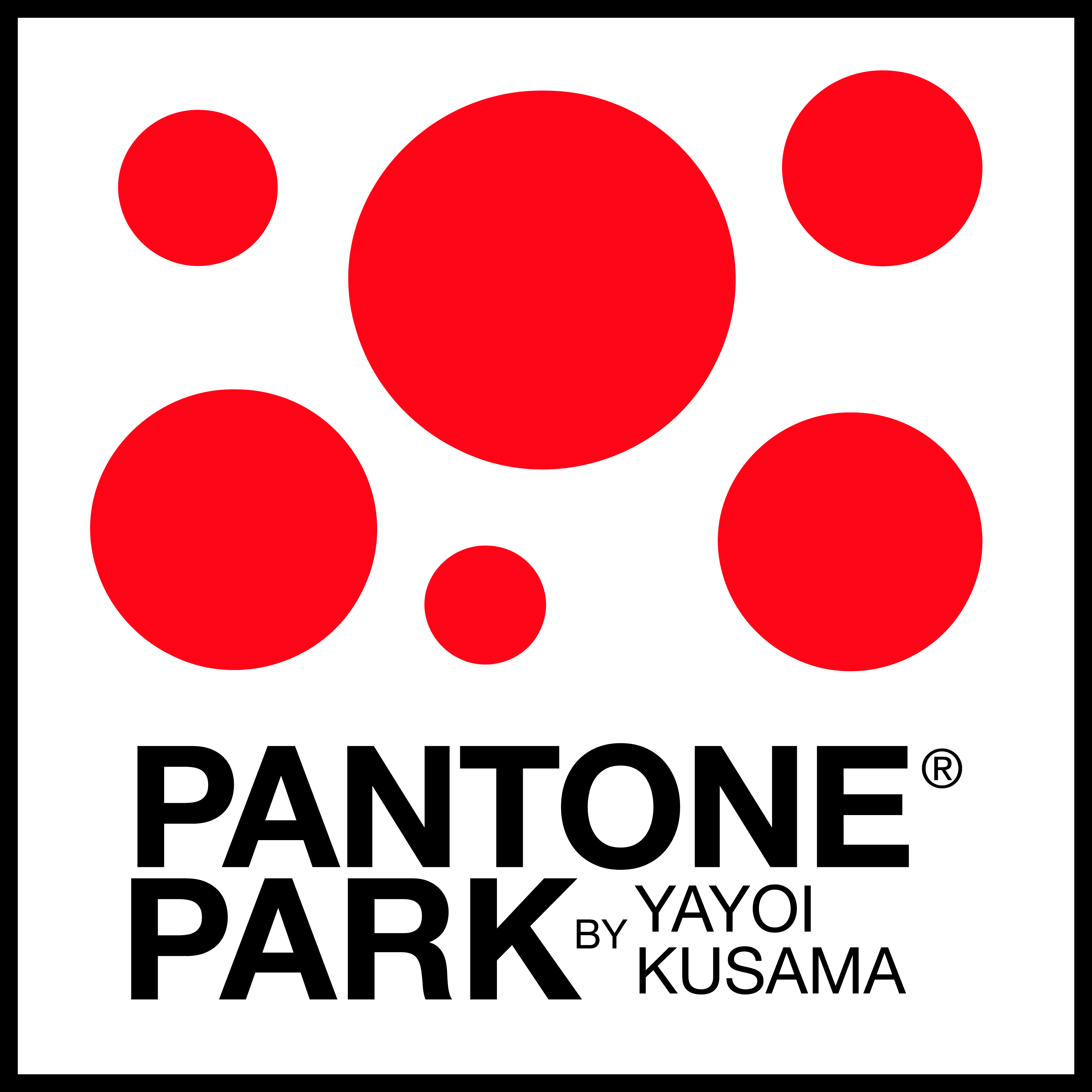
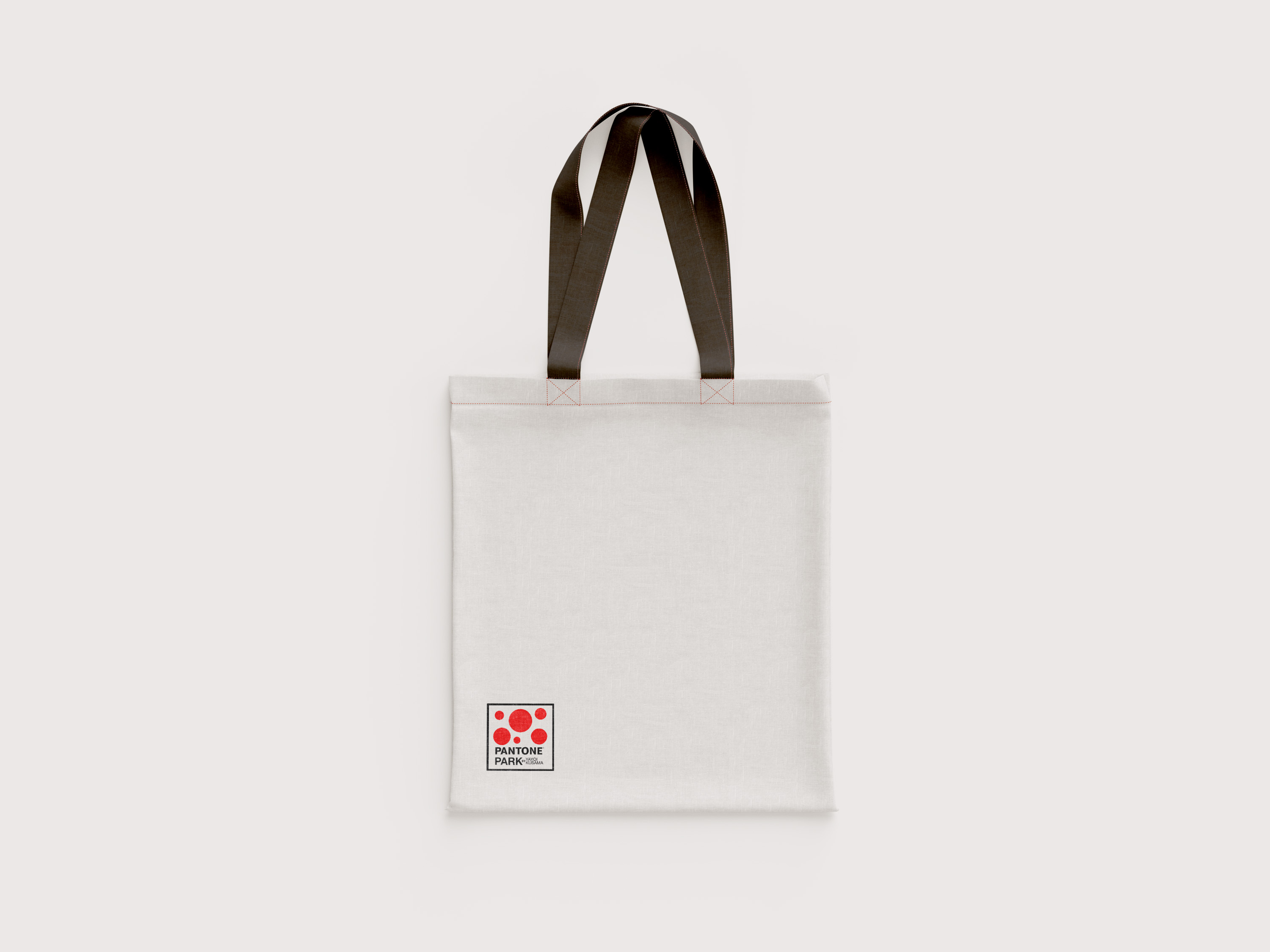
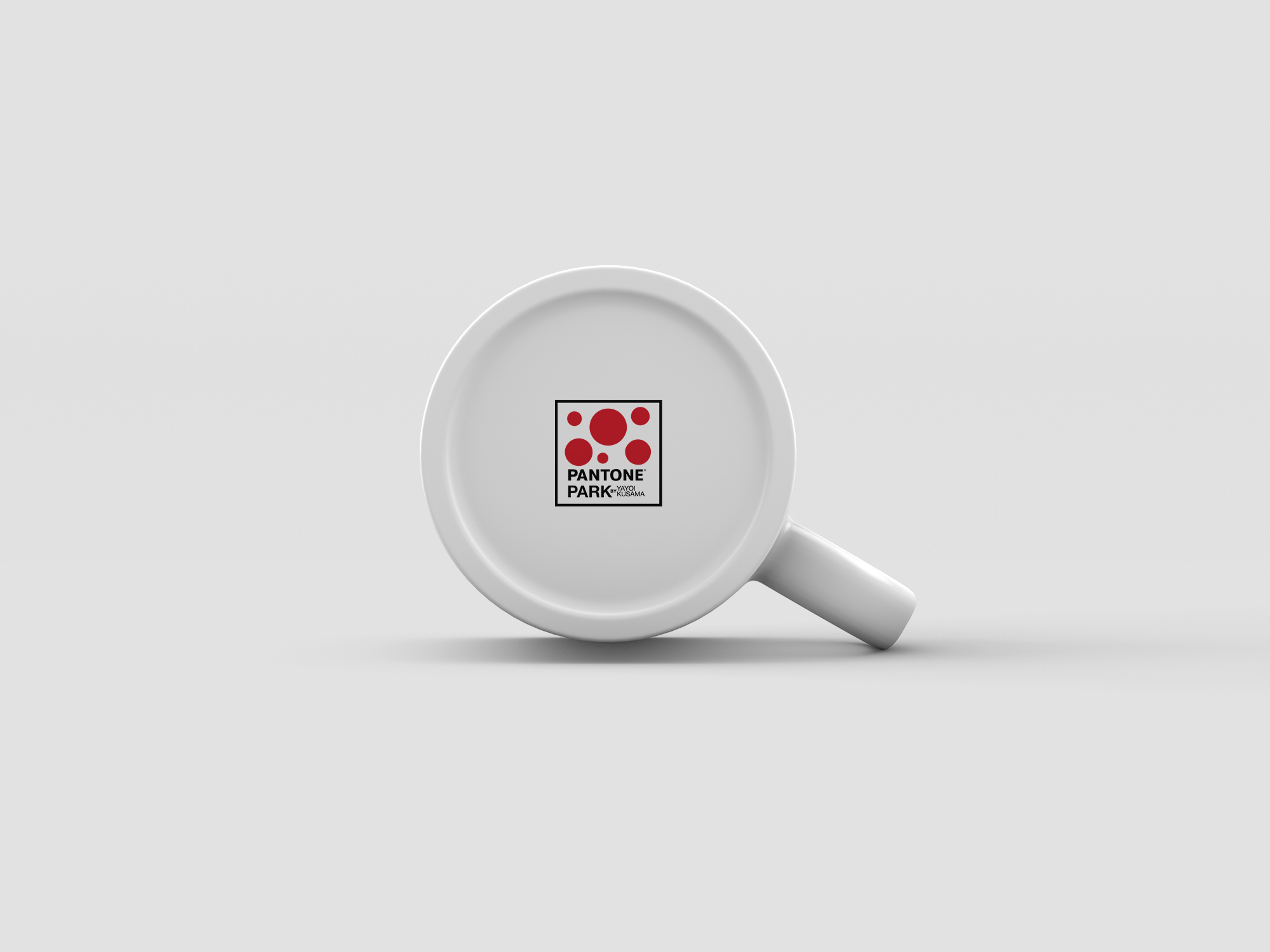
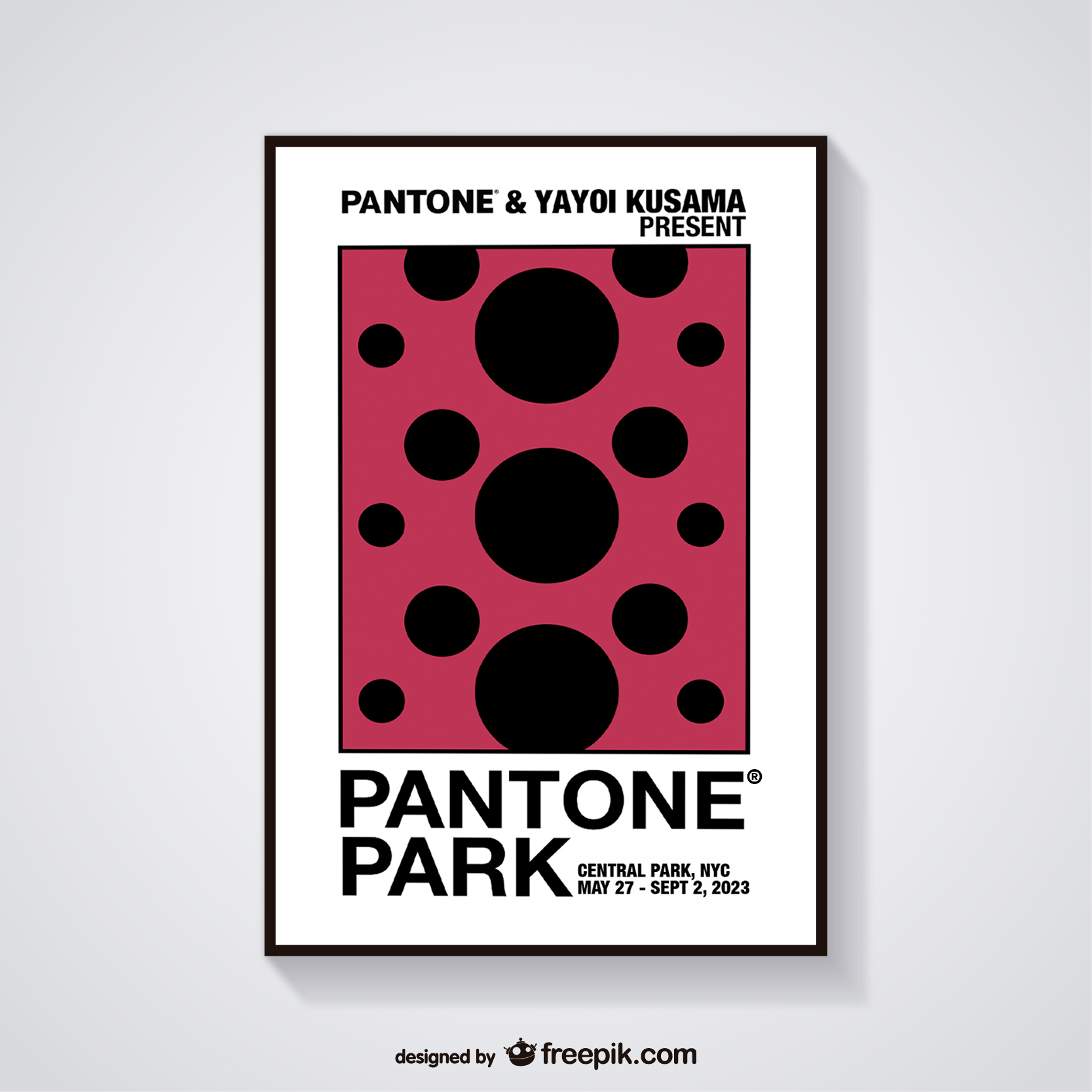
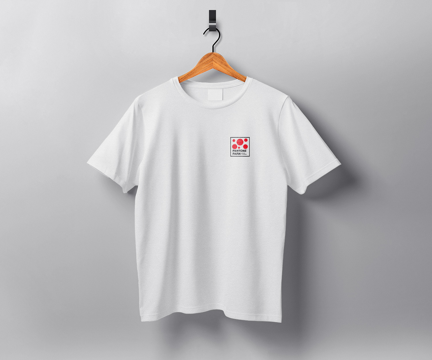
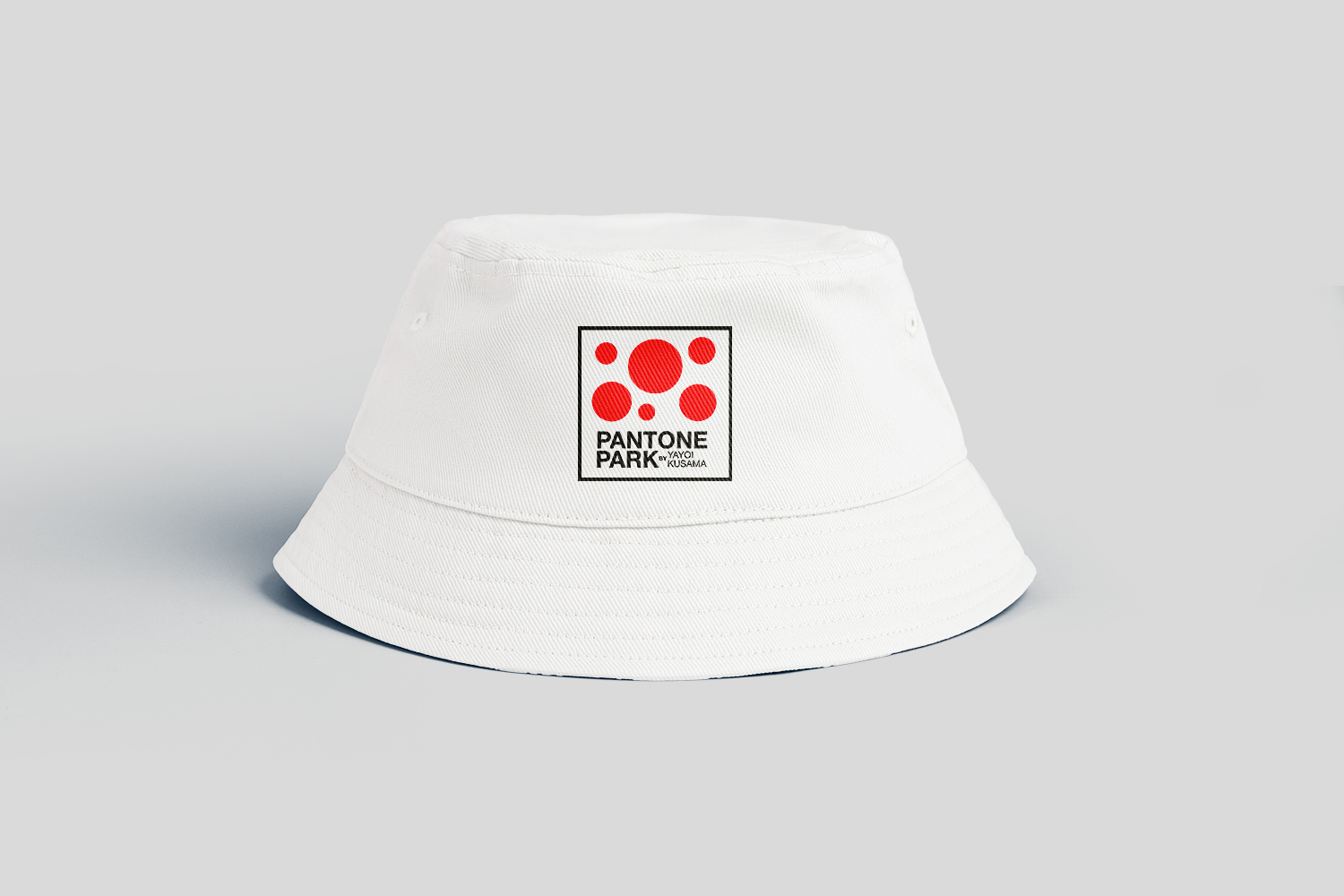
The inspiration behind the logo for this collaborative project between Yayoi Kusama and Pantone is a harmonious blend of cultural heritage and minimalist design principles. Drawing upon the visual identity of three essential colors—black, white, and red—the logo pays homage to both Japanese tradition and the vibrant energy of New York City. Red, reminiscent of the Japanese flag and infused with cultural symbolism, adds a dynamic flair that contrasts boldly against the timeless simplicity of black and white. This choice not only reflects Kusama’s Japanese roots but also serves as a nod to the iconic Big Apple, the playground where her art invites us to explore. The minimalist design, with its repetition of circles contained within a square outline reminiscent of the Pantone logo, further emphasizes the project’s connection to Japanese aesthetics while offering a contemporary and visually striking representation. Thus, the logo becomes a symbolic fusion of tradition and innovation, embodying the collaborative spirit between two iconic entities in the world of art and design.
The Flight Path


The Shop






The Flight Log
CLIENT – PANTONE
ROLE – ART DIRECTOR
TOOLS – ADOBE ILLUSTRATORS, INDESIGN AND PHOTOSHOP
TIME LINE – OCTOBER 2022
FIRST STAGE WEEK 1 & 2 – color palette, scope of work,
first drafts submitted for approval;
SECOND STAGE WEEK 3 & 4 – design execution, mockup productions,
presentation design and final edits.

 Dani Galindo - Art Director & Creative Strategist